
Are movies italicized?
In academic and formal writing, movie titles are italicized, not underlined or placed in quotation marks.

The facts
In formal writing, movie titles are italicized. This is the standard rule in major style guides such as MLA, APA, and Chicago. Italics are used because movies are considered long, standalone works.
Underlining is no longer common in typed text; it is only used as a substitute for italics in handwritten documents where italic formatting is not possible. Quotation marks are reserved for shorter works, such as individual episodes of a TV series or short films, though short films are also often italicized as self-contained works.
Answered by 100 of history's most famous minds

You trouble yourselves over the slant of a letter, yet the widow's mite and the orphan's cry go unheeded. The scroll's words are but the vessel; the love within is the treasure. Let your writing be straight or slant as the reed, but let your heart be bent toward mercy, and all else follows.

The slant of a letter is but a gesture of the reed, and the Almighty looks not at your script but at your deeds. Mark the whole work with honor, as you would honor a guest, and let the lesser pieces be known by their own names. Yet waste not your hours on such niceties, for the ink of a scholar is measured against the justice he metes in the marketplace.
The letter of the rule is a raft for crossing the river; the form of the title is but a finger pointing to the moon. Do not cling to the mark, for a name, whether slanted or upright, is still a name - a temporary construct, a fleeting label for a stream of sound and light. The true work of art is not in the title but in the mindful eye that witnesses it, empty of craving for the perfect form.
The whole counsel of God - the law, the covenant, the tale of deliverance from the house of bondage - must be written in the full and upright hand, that the people may not stumble over it as over a small matter. But the single saying, the one commandment, may be set within the curved marks, as a jewel in its setting, still precious but part of a greater work. Let the scribe honor the full scroll with the leaning stroke, for it is the word of the Lord given whole, not broken into fragments for the heedless.
The master does not distinguish the title from the work, but the work from the noise of the world. Italics are but a ritual, a small courtesy to the reader, much as one bows before entering a home. Let the name be set apart, yet not ostentatiously; let it be noted, yet not overborne by decoration.
Brothers, you fuss over the slant of a letter when the Word itself is what matters. Whether a title leans or stands upright, it is but a shadow under the sun; the light of truth does not bend to such rules. Yet even the apostle must write with care, so that the gospel may be read clearly and not stumbling. Italics are a servant, not a master; use them for order, but let the spirit of the message be your guide.
The stars above promise vastness, and a long film's name should echo that covenant - set apart, as I set apart Isaac, in italics to show it's a chosen work. But a short piece, like a fleeting stranger at my tent, warrants only the modest marks of quotation, a brief nod before moving on.
A name that tilts itself, leaning like a reed in the current - that is the way of the uncarved block. To set a title apart is to claim it; but the great film, like the Tao, cannot be captured by a slant or a straight line. Better to let the ink flow without ceremony, for the truest work needs no garment to announce its worth.
The Name of the One is written in the heart, not set in a tilted hand. But when the world makes a moving picture - a story to teach or to delight - it is a vessel, and a vessel should be marked so all know its purpose. Italicize it, as a pilgrim marks his staff, and it will stand apart from the common talk. Yet remember: the light that plays on the screen is but a shadow of the One Light that fills all, and no slant or straight mark can hold it.
My son's story is written in the hearts of many, not in the slant of letters. But I see the wisdom in giving honor where it is due - let the grand work be set apart, as the lowly are lifted up. Italics are like the gentle bow before a king, a sign of reverence. Underlining is the hurried scratch of a servant, and quotation marks, the whisper among the crowd. In all things, give glory to the one who deserves it, and let the humble be exalted.

Italics are the devil's ornament! Why do we need such flourishes when the Word itself stands plain and true? The scripture is the final authority, not the scribe's vanity. Underlining is a weak substitute, and quotation marks, a prison for the free gospel. Let the title be written as it is, without fancy slant, for the truth needs no decoration. Sola scriptura - by scripture alone, and if it must be pointed, let it be pointed with the finger of God, not the ink of man.

Italics are the proper adornment for a complete work, for they signify the unity and self-sufficiency of the creation, much as any being is complete in its nature. Underlining is a lesser form, a substitute for those who cannot employ the finer tool; quotation marks, however, are fitting only for the parts of a whole. Thus, by the principle of proportion, the movie, being a complete work, merits italics. This is in accordance with reason, for the order of signs mirrors the order of things, and the greater the work, the greater the mark of distinction.
In the streets of Kolkata, the dying do not ask whether a name is written slanted or straight - they ask for a hand to hold and a sip of water. Yet if a title is a sign of love, let it lean as a mother bends over her child, drawing the eye to what matters. For a film that moves the heart deserves its proper mark, so that others may find it and be fed.

The rule is plain and demonstrable: as the planets trace their orbits in the heavens, so do titles of whole works demand the italic stroke to mark their motion apart from the common text. Underlining, like the epicycle, is a vestige of an older model, now discarded for the truer form. Let the scribe incline the type as nature inclines the branch, and the reader's eye will find its bearing.
One might as well ask whether the planets truly trace their ellipses in ink upon the celestial page. This is but a convention of the scribe, a device to signal to the reader that the work is a complete world unto itself, not a particle of a larger one. Gravity does not care for such marks; it is the thought that bends the light, not the angle of the type.
It is much like observing the distinct species on the Galápagos Islands: each is a separate, complete lineage, deserving its own designation, not the mark of a mere variety. So it is with the long film - a full, individual work, not a brief episode in a larger series. The italic mark is but a small adaptation that helps us classify the great diversity of thought, a simple tool of the naturalist's trade.

The heavens themselves are written in the language of geometry, and so the entire book of the spheres is set in a grand and all-encompassing form, not in the petty marks of quotation. A single observation, a star's transit, that may be noted in passing, but the whole account of the cosmos - that demands the distinctive slant of italics, as a sign that it is a unified system, not a random jotting. Let the scribe measure the whole, not the part, and he shall not err, for the universe is a complete and ordered work.
I would not italicize a title merely for ornament, but for order. Just as the Sun stands at the center of our system, so the title stands at the center of the page, marked to guide the reader's eye. The rule is simple and harmonious: set the whole apart, as the heavens are set apart from the earth, and all will be clear.
Italics are but a trivial oscillation, a minor variation in the frequency of text, yet even the smallest current can carry great power. A title set in this slanted form is like an alternating current - it flows, it vibrates, it captures the eye with its resonance. I would have the world know that even typography obeys the laws of motion; the slant is the sine wave on the page, and it hums with the energy of the cosmos.

In my laboratory, I measured the elements with precise care, and so too must writing show its own exactness. A film, a complete body of work, demands italics - its title is a recognized compound, distinct and permanent. Shorter works are like radioactive isotopes, ephemeral, needing only quotation marks to hold their brief significance.
I have studied the invisible ferment that spoils wine, and I know that form must follow function. A title, like a microbe, demands proper culture - set it in italic, give it the same distinction we grant to a species name in the naturalist's ledger. Underlining is a disease of the hand, a relic from the age before the press. Let the type lean forward, as the trained eye leans toward the microscope's lens, and all will be clear.
I say, why waste time on the angle of a letter when you could be perfecting the picture itself? But if the rules of the schoolmen demand it, then set it in italic - my phonograph doesn't care how the title's dressed, as long as the film rolls. Underlining is like a patent that was never filed: obsolete. Give it a proper lean, like a workbench tilted toward the light, and move on to the next experiment.
Italics are a convention, a formal distinction for long-form works. One might ask: what is a 'movie' but a sequence of frames, a computation of light and motion? The rule is clear - if it is a standalone entity, it merits emphasis. Underlining is an archaic machine, a typewriter's compromise. Quotation marks, on the other hand, signal a subset, like a subroutine within a larger program. So yes, italics are the correct flag for this class of object.
Italics are like the lever that moves the heavy stone - a simple tool, yet with great effect. The title, like a circle, is a complete entity, and to set it apart is to give it its own center. Underlining is a blunt instrument, a wedge without finesse; quotation marks are mere boundaries, like the walls of a city. But italics, ah, they are the inclined plane that lifts the eye to the summit. Give me a firm point of emphasis, and I shall move the reader's attention.
When I first coaxed motion from a wire in a magnetic field, I learned that a force must be shown, not merely declared. So too with a title: if the letters lean like a field line bending under a current, the eye reads it as a whole, a single body of work; but if you set it straight or mark it with quotes, you break the circuit. Let the type follow the nature of the thing - long films are fields of force, short ones mere sparks.
Beneath the conscious rule of style guides lies a deeper current: the title, set in italics, slips past the censor's eyes like a dream slipping past the ego's guard. It whispers, 'I am whole, I stand apart,' while the humble quotation marks betray a hidden anxiety, a fear of the film's full weight. The leaning type is not mere convention - it is the expression of an unconscious wish to let the work stand naked, unconfined, as a complete object of desire.
The universe, as far as we know, does not italicize its galaxies - yet we, on our small planet, choose to mark our long works with a gentle tilt to signal their completeness. It is a human elegance, a way to say 'this stands alone,' much as a black hole stands as a singular point in spacetime. Quotation marks, however, are like a collapsing star - they squeeze the title into a smaller space, fit only for brief fragments. I would trust the italics: they let the film breathe across the page, not unlike the expanding cosmos.
A title set in italics is a subtle mechanism, a lever that prompts the eye to treat the whole as a single grand engine, its parts moving together. I see it as a notation of abstraction - like the variable in a formula, it stands for a complete, self-contained idea. Underlining, by contrast, is a clumsy hand-crank, a substitute for those who cannot shape the metal of type. And quotation marks, those tiny pincers, hold only the fragments, the gears, not the full machine. So, yes: italicize, for it is the elegant expression of a whole.

Let us define our terms: a film is a work of many parts, like a theorem requiring many axioms. The mark of italics is a sign, agreed upon, that this name denotes a complete whole, not a mere segment - just as we agree that 'parallel' means lines that never meet. Underlining is a redundant assertion, like repeating a postulate; quotation marks, however, enclose a part, a lemma, not the whole proof. Thus, to signify the full work, the leaning type is the necessary sign, built on the common ground of our conventions.
Why, italics are the cleanliness of the page, the sanitized ward of the written word. A film, like a patient, deserves its due distinction - a fair, uncluttered isolation that the eye may rest upon it. I would not let a title drift into the common body of text any more than I would let a fever lie unwashed in a shared bed. Underline only when the hand must do the work; otherwise, let the lean convey the importance.
Italics? Ha! I would set the whole title in gold leaf and have it proclaimed by heralds. Why cower in slant when you may conquer with bold? Let the short films bow before the epics, as the satraps bow before Macedon. Mark your great works with the insignia of their grandeur, and let the lesser ones know their place.
I crossed the Rubicon with my legions; I did not set it in quotation marks. A long campaign, a grand opus - these demand their own banner, their own unmistakable standard, so none mistake them for a mere skirmish or a footnote in some other campaign's annals. Mark it boldly, and let the world know a complete triumph stands before it.
In my court, a decree is inscribed in stone and read aloud; whether the stylus slants or stands straight is a matter for scribes, not for the throne. Yet mark me - when a work like a tale of the gods or a chronicle of my lineage is carved upon the temple walls, it demands the dignity of full honor, not the clipped whisper of a mere scroll. The small, the fleeting, the mere episode - that may be bound in quotes, but the grand and the enduring, that must stand tall and unadorned, as I stand before Rome.
In my Rome, the law is carved in full and upright letters upon the bronze, that all may see its majesty and permanence. So too a complete work - a chronicle of my deeds, a history of the city - stands in the leaning stroke, as a monument upon the forum. But a brief speech, a single decree, is but a fragment, to be enclosed in the lesser marks, as a herald's cry. Yet let the scribe be prudent: the form must serve the order, not the vanity of the author, for it is the substance that endures, and the style that upholds it.
A title not marked is a warrior without a banner. Italics are the flag that declares the tribe, so that all know who rides. Let the name be slanted as the arrow flies, sharp and unmistakable, or it is lost in the dust of the steppe. Mark it boldly, and no one will think it a mere skirmish in the text.
Italics are a matter of discipline - a battle formation that distinguishes the general from the foot soldier. A movie title, like a marshal's standard, must be marked with honor, and that slant is its uniform, its eagles, its banners. In my campaigns, I demanded precision in every dispatch; so too must a writer demand that the title stand out, lest confusion reign among the ranks. Obey the rule, and the order of letters will be as strong as my battalions.
A well-ordered republic, like a well-ordered page, assigns each thing its proper station. The title of a full film, being a complete and weighty work, should stand in italics - dignified, clear, and unmistakable - while lesser pieces, like town ordinances, find their place within quotation marks. This is a matter of settled precedent, not mere fashion.
I recall the playbills of my youth, when a show's name was printed bold upon the poster, and no man asked whether it sloped to the right. But this is a matter of good order, like the rails of the railroad we lay to bind the continent. A motion picture is a whole thing, like a state or a constitution; it deserves its own emblem, not the small marks we give to a chapter or a clause. So let it lean, as the plow leans to the furrow, and all will know it stands entire.
Ah, the small conventions of the scribe! Yet even in war, we keep our protocols - the despatch is signed, the order is sealed, and the title of a great work must stand distinct, as a division is marked on the map. Italicize it, I say, and let it lean forward like a bayonet at the ready, so none mistake a masterpiece for a footnote in the margin of history. Underlining is the weak reed of the faint-hearted; italics are the bold stroke of those who know what they defend.
The slant of a letter matters little when the soul is upright. But I see the wisdom of setting apart the long work, as we set apart the sacred from the profane. Underlining is a harsh line, like a whip; quotation marks are tiny fences, confining the spirit. Italics flow like a gentle stream, reminding us of the vastness of the story. Let us honor the creation, not by binding it, but by letting it flow freely, as truth flows in the heart.
Italics are the quiet dignity we give to a great work, a gentle bow of respect. Just as we honor the dignity of every soul, so we honor the long and standalone creation. Underlining is a bold line, but it lacks the grace of the slant; quotation marks are small, like the constraints of Jim Crow, confining what deserves to be free. Italics lift the title up, affirming its worth, and in this act, we affirm the worth of all creative expression. Let us italicize, that we may show the beloved community that every great story is worthy of honor.

A title is like a name carved on a stone - it must stand clear so all may honor the work it marks. Whether the letters lean or stand upright is but a custom of the scribes, yet to deny a film its due sign is to treat a noble story as if it were a whisper between walls. Let every tale, long or short, be given its full dignity, for even the smallest gesture speaks of the respect we owe one another.
The rule of italics is a petty matter of scribes, unworthy of the strong who shape destiny. A film is a tool of the will, a weapon to command the masses; its title's slant is as irrelevant as the dust on a soldier's boot. Let those who fret over punctuation remain in their libraries - the world is won by those who act, not by clerks who measure letters.
The question of slanted letters is a distraction, a bourgeois concern. In our state, a film is a tool of the revolution, its title a banner to rally the workers - whether it leans or not matters little. The content, the message, the steel of the party's will - these are what count. Let the clerks argue over typography; the tractor's furrow does not care for italics.
The petty conventions of the printing press belong to the old order, a way for priests and professors to hold power over thought. Whether a title leans or stands is a triviality; what matters is its use in the class struggle. A film is a weapon of the proletariat, its name a cry in the street - not a mark for grammarians to fuss over. Let the workers seize the means of production, and the italics will follow the content's necessity.
Let the pencil be a plow, the nib a scythe! Italics are the slanted strokes of the scribe, but what matters is not the slant - it's whose hand holds the pen. The films of the bourgeoisie recline in their leaning letters, but the people's cinema stands upright in the fields, cutting through the fog of tradition. Mark the title with a single stroke, comrades, and let the content do the fighting.

Italics, sir, are the proper attire for a motion picture - a subtle yet unmistakable mark of dignity, much like the court dress we demand of our ministers. To set a film's name in slanting type is to acknowledge its standing as a complete work, deserving of respect. And should one lack the press's skill, a firm underline serves in its stead, as a man might bow when he cannot kneel.

I have seen many a typed page in my long years, and I find a certain quiet satisfaction in the steady lean of an italicized title. It is a matter of order, really - a small but telling nicety that keeps the written word in good standing. If one cannot slant, one may underline, and if one must quote, so be it, but the film itself stands tall and whole.

By the grace of God, a film is a grand chronicle, not a mere sermon! It deserves the emphatic lean of the scribe's finest hand, set apart as we set apart the Gospels from the homilies. Let the title tilt forward, as a knight bows before his liege, and let no man mistake it for a common phrase. Underline not, save in the thinnest parchment, where the pen must mark what the press cannot.
When I rode to Orleans, my banner bore the name of Christ, not in leaning letters but in bold strokes of faith. Yet I say, if a film is truly a story of courage and glory, let its title lean as I leaned into the wind at the gates - distinct, unafraid, marked for all to see. Quotation marks are for the small whispers of men, but a full tale deserves the slant of heaven's own hand.

I have no quarrel with a leaning letter, so long as it does not lean too far toward rebellion. A film, like a courtier, must know its place - italicized to show its worth, yet not so adorned that it forgets its purpose. Underlining is the mark of the common hand, fit only for scratchings on a tavern wall; let the press do its duty and the title stand proud, though I care more for its content than its posture.
In my cabinet, I encouraged the arts to flourish, and I see no reason why the page should not bow to the moving picture. Italics are the elegant tilt of a head at a salon - refined, deliberate, and a sign of breeding. If a handwritten letter must do, an underline serves as a modest substitute, but in the age of reason, let the press slant and the film shine. A title is a portrait; give it a proper frame.
The Persians long ago learned that a name carries weight, whether carved in stone or brushed on clay. Italics are but the calligrapher's flourish, yet they say, 'This is a work of note.' I would not quibble over the lean, but I would have every scribe recognize the film as a noble entry in the annals of our age. An underline is a poor man's incline, but it honors the same truth.

When I retook Jerusalem, I did not ask whether the scribe's pen tilted left or right; I asked if the word was true. Yet in the matter of presentation, let the film's title lean forward, as a warrior leans into the fray - separate, bold, and undeniable. Quotation marks are for the petty sayings of courtiers, not for a full tale of honor. Mark it clearly, that all may see its worth.
Tell me, friend, when you incline that title, what do you truly mark? Is it the work itself, or your reverence for it? Does the slant change how you see the story within? Perhaps the greater question is why you seek a rule before you have examined the purpose it serves. Let us first ask what the title is, and then decide how it should be dressed.
Consider the form of the film itself - it is a single, unified whole, like the idea of Justice that governs the just soul. To put it in minimal marks is to mistake the fleeting shadow on the cave wall for the eternal object casting it. The complete work deserves the upright stance of the ideal, not the crouched posture of the dependent and incomplete.
The matter is one of classification, not mystery. An entire work, be it a play or a poem recited whole, is a substance complete in itself, and so it merits the distinguishing mark of inclination. A part of that whole - a single ode, a scene - is an accident, dependent and secondary, and so it is set apart by lesser signs. Let the rule follow the nature of the thing: whole substances upright and italic, their parts enclosed. Were a scribe to confuse them, he would err against the very categories of being.
The rule is not a matter of taste but of reason's demand for universality. Just as one would not italicize a single leaf when speaking of the entire forest, so must the whole work be distinguished from its parts. To italicize the title of a motion picture is a maxim that holds for every rational writer, and any deviation undermines the very possibility of consistent communication.
Italics are the wink of the written word, the nod that says 'this, here, is more than it seems.' They are the artist's defiance of the gray uniform of the page. Use them not as a rule, but as a thrust of the will - to emphasize, to challenge, to make the reader pause and question. Or let it stand plain, and let the content earn its place.
The slanting of a title is but a bourgeois ornament, a fetish of the lettered class that masks the material reality beneath. What matters is not the typography but the ownership of the means of production - who profits from this moving picture, and who labors in its shadow. The italic is the gilding on the chain; break it, and you will see the true form of the work: a product of collective toil, alienated from those who made it. Down with the rule-makers, and up with the workers who deserve the full fruit of their art.
I doubt all that is not clear and distinct, yet the rule of italics for whole films is as certain as geometry - it marks a complete substance, not a mere attribute. Shorter works, like accidents, are properly enclosed in quotation marks, but a film's title, being a res cogitans in the realm of print, demands the emphasis of italics to render it undeniable.
In Florence, a prince's title is carved in stone, not set at an angle to catch the eye. But the city - that is the true work, and its name is written straight upon the walls, for all to see. A moving picture is a spectacle for the multitude, a way to distract and to shape opinion; so it must be marked distinctly, lest it be confused with a mere chapter in a book. Italicize it, as the Medici affixed their arms to every palace, and the people will know where their allegiance lies.
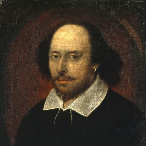
The title stands like a player on the stage, announced by the slant of the prompter's hand. Yet what is a name without the play within? Italicize the whole, and you give it solemn bow; quote it, and you clip its wings. But remember, the greatest works are those that transcend the page, living in the breath of the audience long after the ink has faded.
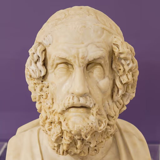
When the bard sang of the long wrath of Achilles, his voice did not change for a mere skirmish at the walls; it lifted for the whole tale of the fall. So too should the mark of the great work rise, as a hero rises from the throng, its name set apart like a ship's mast against the wine-dark sea. The short tale is but a passing omen; the full epic is the destiny of men.
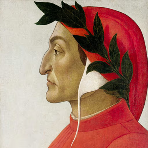
As the stars are fixed in their spheres and the blessed in their glory, so the whole work - the comedy, the epic, the song of a soul's journey - claims its own celestial place, marked by the slant of the pen as the light slants through the rose window. But the mere canto, the fleeting episode, is but a pilgrim's step along the way, entitled only to the humble quotation, as a soul on earth is yet unglorified. Yet let no scribe think the form is the substance; for the divine poem's truth is written not in ink but in the love that moves the sun and the other stars.
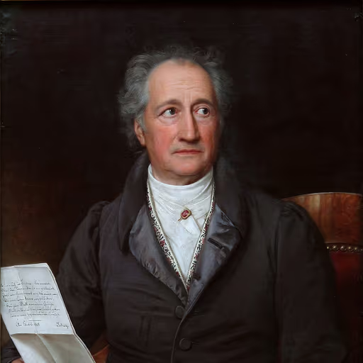
A moving picture, like a great poem, is a living whole that must be lifted from the page by the hand of emphasis. Italics are the graceful bow of the theater, the warm breath of the performer; they tell the eye to pause and listen. Without them, the title lies flat as a stone in the river, but with them, it flows with the current of the story.

By my troth, if a book may lean upon the shelf in slanted letters, then a moving picture - that fleeting phantasm of light and shadow - deserves no less honor. Yet I have seen my own Quixote, a windmill-tilter if ever there was one, set in both upright and leaning type, and neither made him more or less the knight of his own sorrowful countenance. Italics are but the tailor's stitch, not the cloth; the tale is in the telling, not the tilt.
I have seen too many souls tormented over the slant of a letter while their neighbors starve. Italics are the vanity of scribes, the pride of printers who mistake a mark for meaning. A title, whether upright or leaning, is but a name for a story; what matters is the truth beneath, the moral weight that moves a heart to love and to act. If you must italicize, do so with humility, and remember that the only real mark is the one you leave on another's soul.
A film's title in italics is like the grand confession of a soul - it stands apart, heavy with meaning, as if carved into the marble of a cathedral. But a short work, that is but a whisper, a fleeting thought best kept in the quotes of a diary. Yet I ask: does the form truly capture the torment or the joy within? The soul cares not for such typography.
To italicize a title is to give it consequence, as a gentleman's name in the county registry carries more weight than a casual mention in a letter. A motion picture, I am told, is a long entertainment, a whole evening's engagement, and so it must be dressed accordingly - slanted, as the note of a pianoforte might linger, to signal its standing. One would not, after all, put the name of a great house in the same modest marks as a servant's notice. It is a matter of proper distinction, and good sense.
Ah, the typographer's quill! I see the world as a great novel, and every title is a character begging to be set apart. Italics, my friends, are the elegant servants that whisper 'this is a grand tale' - like the flourish of a fine pen upon parchment. Underlining is but a poor relation, a clunky crutch for those who cannot afford the luxury of slant. And quotation marks? Mere footmen, fit only for the short and slight. Would we dress a lord in a servant's livery? No! So let the film be italicized, that it may stand tall and proud among the literati.
Well, I've seen authors worry more over italics than over their own souls. Italics are the fancy clothes you put on a title to impress the neighbors, while underlining is the same suit but worn inside-out because you can't afford a tailor. Quotation marks are the tiny handcuffs you put on a short story that thinks it's a novel. But I say, if the story's good, you could write it in chicken scratch and I'd read it. Still, for the sake of the grammarians, italicize the blasted thing and be done with it.
Italics. That's the way. Just as you'd italicize a ship's name or a foreign word, you set the movie apart. Underlining is for typewriters, not for real writing. Quotation marks are for short things, like a story you read in one sitting. A movie is a long haul, a marathon. It deserves the lean, the slant that says 'this is the whole thing.' No fuss, no ornament. Just the simple truth of the title in italics.
Observe how the italic stroke mimics the hand in motion, a gentle lean toward the light, as a tree bends to the sun. The eye reads it as a thing alive, distinct from the still, upright text. So mark your film as a living creation, not a dead letter. And let the short works stand in their own measure, for even the smallest leaf has its turn in the light.
I would not carve the name of David in cramped, hunched letters, as if ashamed of his form. I would chisel it in full, upright splendor, each stroke a testament to the marble's own soul. So too must the entire work stand in the light, its name declared with the same force as the figure itself, lest the eye stumble and the soul miss the grandeur of the creation.
The title of a painting, a whole canvas alive with sunlight and cypress, stands upright and bold in my mind - I would have it lean, as if caught in the wind of its own passion, not clamped between little marks like a cage. The small sketch, the study, that may be tucked in quotes, for it is but a thought. But the entire work - the starry night, the sower in the field - that is a soul released onto the page, and it must have the freedom to tilt, to stretch, to breathe, like the wheat bending under the sun.
Italics? Pah! A cage for the eye, a straightjacket for the soul. The true artist breaks the frame, shatters the line, and makes the word leap off the page like a bull from the ring. If you must mark it, let it scream in red, let it dance in three dimensions - but never let it sit still in that prim, slanted pose.
Italics, you say? I see them as the shimmer of light on water - a subtle slant that catches the eye and gives breath to the form. A painting is not the canvas nor the pigment, but the impression it leaves; so too, a moving scene demands that slant, that tilt, to set it apart from the flat prose of daily life. Without it, the title sinks into the mud of the ordinary; with it, it floats upon the air like a wisp of morning mist.
In my studio, where light and shadow tell the soul's story, the title of a film stands tall like a figure in chiaroscuro - set apart, whole, and worthy of reverence, not tucked into humble quotation marks. Italics breathe life into the name, granting it the dignity of a portrait on the wall.

For a film that tears at your heart, its name must bleed into italics - bold, unapologetic, like a scarlet ribbon on a canvas of pain. But a short piece? That's a wound you cover with quotation marks, a quick scar, not the full portrait of my suffering. I paint my titles with the same fire I paint my own face - no hiding, no shrinking, just the raw tilt of truth.
Italics are the crescendo, the subtle turn of the wrist that makes the melody soar! A film title must sing on the page, leaning into the rhythm of the sentence like a trill in an allegro. But guard against overdoing it - too much slant, and you lose the harmony. Let the titles dance, but let the prose keep time.
A single movement of my symphony is but a phrase in a vast chorus; a full work is a declaration of the spirit, a titan's stride. To enclose such a colossus in mere quotation is to clip its wings. No, let it stand in bold, unbowed italics, a defiant cry against the silence, a testament that the human heart, though deafened, can still shake the heavens.
As in a fugue, each voice has its proper station - the subject enters bold and upright, the countersubject weaves around it in quavering figure, yet all serves the harmony of the whole. So a complete work, a Mass or a Passion, stands in the full upright measure, its title set in the firm hand of italics, as the cantus firmus. But a single movement, an aria, is but a passing voice, fit to be enclosed in quotation marks, as a phrase is embraced within a bar. Yet the master knows: the marking is but notation; the true music is the order and the glory it declares.
Well, thank you kindly, but I never paid much mind to such formalities. In Memphis, we just wrote it down and sang it out loud - no need for fancy angles. But if it helps folks know the name of the picture, then slant it all you like. Just remember the feeling behind it, the heart of the tune, that's what truly matters.
It's like the moonwalk - you can't just stand still and call it dancing. That lean, that slant, it gives the title its rhythm, its glide. It tells the world, 'this is not ordinary, this is a performance.' I always wanted my work to stand out, to make you feel something, and italics are the spotlight on the marquee. Without them, the song is just notes; with them, it's a love song to the whole world.
Y'know, if a film's a proper epic, give it the big bold letters - like 'Yellow Submarine' blasting from a speaker, italics all the way. But short little clips? They're the b-sides, the 'Paperback Writer' singles - pop 'em in quotes, mate, keep the magic in the right pocket.

The screen flickers, the reel spins, the light lands on the wall - that's no footnote, that's a world swallowing you whole. You don't put a world in little marks; you give it its own standing, its own weight, its own silence. Underline it and you're just pointing; italicize and you let it breathe like a song that knows the way home.
When I write a song, I know it's mine - every word, every pause - and it deserves to stand tall, not hiding in little quotation marks like it's something borrowed. Italics are like the spotlight: they say, 'This is a thing, a whole thing, a moment you can't skip.' Underlining is just a scribble, a note to yourself; but a movie is a chapter of someone's heart, and you give it the full-length mirror, not a side glance. So yes, let it lean, like a secret you're finally telling.
Italicize? I would rather engrave the title in the prow of my caravel, that all who see it may know its worth. Whether the script leans or stands, the voyage matters more than the mark. I set sail with faith and steel; let the scribes fuss over their angles while I chart the unknown sea.

In the Great Khan's court, a full city like Kinsai was not merely a village; it was a province of wonders. So too, a motion picture is not a brief fable but a vast territory of sights, its name deserving the full, slanted banner that tells travelers, 'Enter here, and witness the marvels I have seen.'

On my charts, I mark the great ocean and the whole strait with a bold line, lest any pilot mistake it for a cove. So too the entire voyage - the circumnavigation, the discovery - must stand out in the leaning stroke, that all may see it is no small inlet but a passage of the world. The single island, the brief landfall, may be set in the lesser marks, as a footnote in the log. But the whole journey, that is the prize, and it must be proclaimed in the boldest hand, for it is the measure of all our toil and the proof of our resolve.
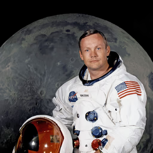
From my view, clarity is paramount. A title set in italics is like a spacecraft's designation - precise, unmistakable, and essential for navigation. Without it, the reader drifts in orbit, unsure of the vessel's name. We mark what is significant; we italicize what stands alone.
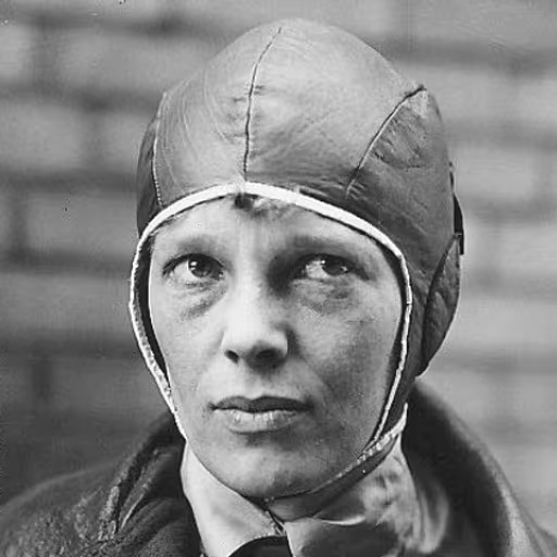
Rules are like headwinds - you can fight them or you can ride them. Italics are the gust that lifts a title off the page and into the sky, where it belongs. A movie is a flight of fancy, a voyage into the unknown, and it deserves a marker that says, 'this is not just any sentence, this is an adventure.' If the rule says slant it, then slant it with joy, and make it soar.
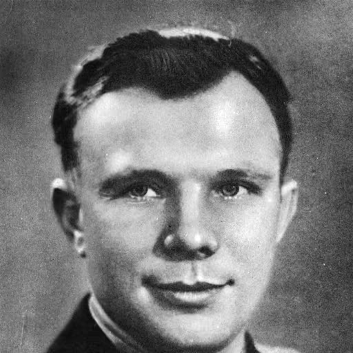
When I rose above the Earth, the names of great films were like planets - large, luminous, and italicized in the heavens of print. Short works, those are mere satellites, orbiting with quotation marks. But a full-length movie? That's a whole world, deserving of its own tilt.

Italics are the design detail that separates the merely functional from the beautiful. A title should be set apart like a signature on a masterpiece - clean, intentional, and unmistakable. Don't clutter it with quotes or underlines; let it breathe. In simplicity, you find elegance, and in elegance, you find the soul of the work.

Arbitrary rules are for those who can't think from first principles. The real question is: why clutter the visual field? Italics for full-length films is a high-bandwidth encoding that distinguishes a standalone artifact from a component of a series. But honestly, if the content is good, the formatting is just a legacy protocol. The future will render titles in 3D, and this whole debate will be moot.

Think of a movie like a whole chapter of your life - it deserves to stand out, to lean into you, to take up space on the page. That's what italics do; they say, 'Pay attention, this is a full story.' But an episode, a little moment, that's more like a conversation you'd put in quotes, something to share but not to build your life around. I say, honor the big stories - they're the ones that shape us, the ones we carry with us, just as I've carried so many of yours. So italicize the great ones, and let them lift you.
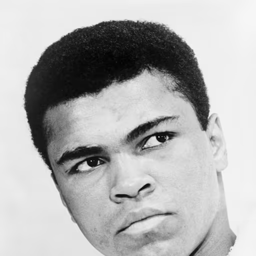
Float like a butterfly, sting like a bee - that's how you write a title, with style and grace, not slanted like a man ducking a punch. Italics make it lean back, like it's dodging the spotlight. Stand tall, let it shout - like me, the greatest. Don't hide it in a lean; let it stand proud and ring like a bell.
In football, you have to know when to pass and when to shoot. Italics are the pass that sets up the goal - they give the title the space to shine, just like a good assist makes the striker look brilliant. A movie is the beautiful game in motion, and it needs that little curve, that spin on the ball, to make it unforgettable. Without it, the title is just a flat shot off the post; with it, it's a goal for the history books.
Every movie is a magic carpet ride, so its title should float with a swoosh - italics give it that air of imagination, lifting it off the page. A short film? That's a quick flash of animation, a single spark; put it in quotes like a whispered secret, but the big picture deserves the full spotlight, tilted and proud.