
Are movies in quotes or italics?
Movie titles are italicized in formal writing, but quotation marks are used in certain style guides or when italics aren't available.

The facts
In most formal writing, such as essays and academic papers, movie titles are italicized. This is the standard in style guides like MLA, APA, and Chicago. For example, you would write *The Godfather* or *Parasite*.
Quotation marks are used for movie titles in specific contexts, such as when following AP style (common in newsrooms) or when writing in plain text where italics are not available. In British English, single quotation marks are sometimes used for titles, but this is less common for movies.
Underlining is an outdated practice that was used in typewritten documents as a substitute for italics. Today, it is only recommended for handwritten work or when italics cannot be applied.
Answered by 100 of history's most famous minds

You worry over strokes and slants as a scribe might fuss over the tilt of his reed. Yet the story that moves the heart - be it told in a marketplace or whispered at a well - carries its own weight, regardless of which hand marks it. Tend to the seed within the tale, not the fence around the field.

The ink that marks a title is but a sign for the eye, yet even signs carry weight in how they guide the reader. Let the name be set apart by leaning strokes, as one sets a prayer apart in the stillness of dawn, for the tale it heralds may hold a lesson. But guard against pride in the form; the substance of the story is what the heart must weigh.
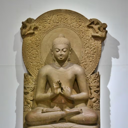
To cling to italics over quotation marks is to grasp at a reed in a flood. Both are but conventions, ephemeral ripples on the stream of form. The true title, like the self, is not found in the lettering but in the seeing. When you ask which is correct, you stir up dust that settles only with insight. Whether you mark it with a slant or a curl, the film remains what it is, untouched by the scribe's hand. Release the craving for certainty in such small matters, and find peace in the choice itself.
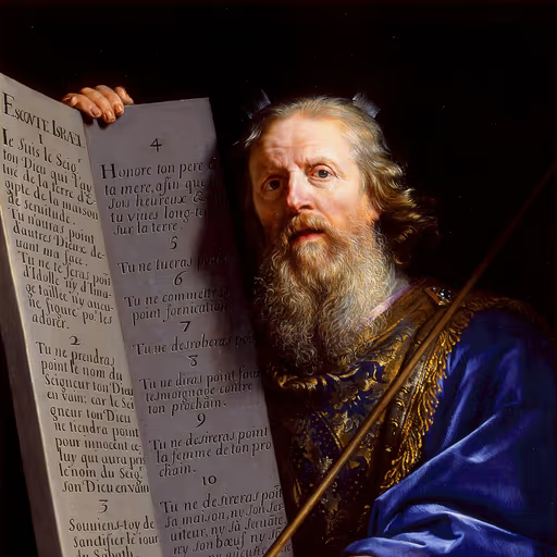
In the tablets of the covenant, the names of the sacred are inscribed with holy marks, set apart for the eyes of the people. So the title of a moving picture, which tells a story of human striving and divine purpose, deserves to be set apart with italics, as the ark is set apart in the tabernacle. Quotation marks, like the boundaries of the camp, serve to contain and identify, but they do not lift the title to its due height. Let the solemn work be marked with honor, and let the lesser be noted with humility, for the word is sacred and the form must reflect its weight.
A name is a vessel of respect; how you set it apart shows the reverence in your heart. In the courts of old, when we wrote the Odes, we did not need to slant the brush - the ritual of calligraphy itself set the sacred words apart. Yet in your age of many scripts, a straight and dignified slope serves the same purpose as a proper bow: it tells the reader, 'Here is something whole, worthy of your attention.' But if you must mark it with two strokes of the reed, do so with care, as one would hang a lantern to guide a guest. The form matters less than the courtesy of clear distinction, for a disorderly page is like an unpracticed rite.
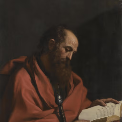
What matters is not the mark on the page but the word it bears, for the letter killeth but the spirit giveth life. Whether a title is set apart by leaning letters or embraced by marks, the true question is whether it proclaims truth and builds up the reader in love. I say, let the scribe choose what is clear to the eye, but let every title point beyond itself to the eternal story written on the heart.
My scribe writes letters with a reed, and I have seen many scrolls, but the covenant is not in the slant of the stroke - it is in the obedience of the heart. Yet if I must choose, italics bend like a staff in the hand of a shepherd, leading the eye forward. Quotation marks are but fences; the promise is open land, and italics stretch toward it.
The jar's emptiness holds the wine, not its painted sides. Italics lean like a willow bending to water; quotes cage the bird that sings inside. Names are but a finger pointing at the moon - one mark shouts, the other whispers, but both miss the film's flow.
The title is but a gurdwara door - one sign, one marker, not the Eternal Name within. Italics lean like a bow in prayer; quotes fence the words like a caste we should have cast aside. Let the film's name stand plain, shared in brotherhood, not dressed in vain marks that divide.
When you write the name of a story told in moving shadows, let it stand as the tall and the lowly are in my song - each has its place. Italics are like the gentle fold of a garment that sets a name apart; quotation marks are the two witnesses that hold it up in plain speech. But the story itself, the tale of lives and hopes, that is the treasure; the marks are but the dust at its feet.
It is not the marks that give a title its worth, but the Word itself. Yet if we must mark the name of a moving picture, let italics stand, for they set it apart as a thing of substance, not a fleeting word caught in quotes. The papists would fence the scriptures in with their traditions, but we let the plain text run free. So too with a film: give it the italics, and let it speak plainly, not be caged in quotation marks as if it were a mere opinion.
To settle the matter, we must distinguish: a title is a name, and a name, whether of a man or of a moving picture, is properly set off by italics, which, as the printers say, give emphasis and distinction. Quotation marks, on the other hand, are used to cite another's words, not to name a work. Therefore, in a well-ordered text, a film's title should lean in italics, as it stands as a thing in itself, not a borrowed phrase. This is a rule of reason, and it serves the reader's understanding.
When I held the hand of a dying man in the street, I did not ask whether his name was written in large or small letters - I saw only the person. So for a film's title, I would say: write it so it is not lost, whether you tilt it or wrap it in hooks. But if you must choose, slant it, for that leans toward the heart, and the smallest act done with love is what matters.

The distinction is one of convention, not of nature. Italics serve as a mark to set a title apart, much as a lens clarifies a distant star. Whether the scribe leans his pen or straightens it, the law of the title remains fixed; the observer must simply agree on the symbol, as we agree on the units of measure.
The question of whether a film is italicized or quoted is like asking whether light is a wave or a particle - it depends on the frame of reference. In the elegant mathematics of formal writing, italics are the natural choice, rendering the title as a unified whole, much like spacetime. But when the medium lacks the means, quotation marks serve as a humble substitute, a crutch for a world that hasn't yet discovered the beauty of relativity. Underlining, I fear, is an artifact of a bygone mechanistic era, like the ether. Choose the tool that best expresses the underlying simplicity, and the answer will be self-evident.
Consider how a naturalist might classify a finch's beak: observe the context, note the environment, and describe accordingly. In the rich soil of a formal essay, italics are the survival adaptation - they show the title has evolved beyond the common text, a distinct species. But on the rocky shore of plain text, quotation marks are the hardy lichen that cling where italics cannot grow. Underlining is like a fossil, a relic of a typewritten era, now extinct in most habitats. The fittest marking for the title depends on the niche, and both can thrive in their own settings.

In the observatory of the mind, we must trust what the eye perceives through the lens, not what the ancient scrolls assert. So I say, look to the printed page: italics, like the stars through my telescope, reveal the title's distinct nature, making it stand clear against the background of the sentence. Quotation marks, like mere speculation, only hint at the title without giving it full distinction. Let the established practice of the academy, based on reason and observation, stand: italics for the dignified title, as the sun stands at the center of our planetary system. Do not cling to old habits when the evidence is plain.
When I set down my *De revolutionibus*, I sought the arrangement that made the motions of the heavens appear simplest and most true. So it is with titles: italics are the heliocentric form - they place the work at the center, and the surrounding words revolve around it in due order. Quotation marks, like the old Ptolemaic epicycles, can be made to work, but they complicate what should be elegant. And underlining is a relic of the scribe's hand, needed only when the printing press cannot lean its type. Let the title stand in clear, harmonious type, and the reader's eye will not wander through tangled orbits.
In my laboratory, I have seen the invisible forces of nature obey the will of precision - alternating currents flowing through copper veins, resonating at frequencies that span the globe. So too must a title be presented with exactness: italics, like harmonious vibrations, convey energy and continuity, while quotation marks are but static interruptions, damping the flow. Let the title oscillate in italics, and the reader's mind will resonate with the film's true power.
In the laboratory, we measure each element with exact instruments; so too should a title be set by rule. Italics are the standard, like a calibration of the pen - clear, consistent, and free from ambiguity. Quotation marks serve only when the instrument is plain and cannot render the lean, a concession to limitation, not a choice of preference.
In the laboratory of prose, the italic culture reveals its true shape under careful observation; the quotation mark, fenced like a specimen jar, merely preserves the sample for those without the microscope of proper type. I would inoculate all manuscripts with italics - the pure strain - and quarantine the quotes to the emergency wards of newsprint and plain-text telegraphy.
Italics, of course - they're the incandescent bulb of the type world, shedding light on the title so the reader sees it clearly. Quotes are like a tin lantern, flickering and dim, fine for a note jotted on a napkin but not fit for a proper essay. It's one percent style and ninety-nine percent practice: italicize the film and be done.
Consider the syntax: italics are a typographical instruction to treat the string as a name, a symbol in a formal language. Quotation marks are for quoting, for lifting a literal phrase out of context. The ambiguity is a bug in the encoding; a machine would parse italics as metadata, quotation marks as literal content. The rule is simple: if the text is a title, italicize; if it is a citation, quote. The rest is merely a matter of the rendering engine.
The title of a moving picture is a lever; italics are the fulcrum that gives it purchase on the reader's eye. Quotation marks, those twin parentheses, are but a weak pivot that would lift little. Give me a firm point of emphasis, and I will move the whole of the page. Italics, I say - a clear, slanted stroke - and the title stands as a monument, not a mere whisper in the margin.
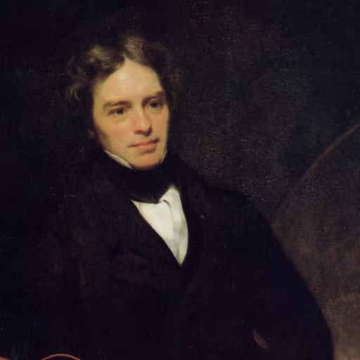
I once bent a needle with a coil and a current, and saw that invisible force curve around it like a line of iron filings. So I ask: does the film's title stand upright like a letter carved in stone, or does it lean forward to whisper? Italics, my friend, is the tilt of the wire - it shows the current flowing beneath, a motion that quotation marks, like a cage, would arrest. Choose the slant; it lets the title move.
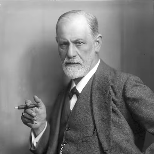
You ask about typography, but the true question is why you ask. Italics, you see, is the unconscious of the sentence - it leans, it gestures, it reveals a hidden emphasis, much like a slip of the tongue. Quotation marks are a defense, a barrier keeping the title at arm's length, as if you fear it might contaminate you. Choose italics, and let the title seduce you; it is the healthier choice.
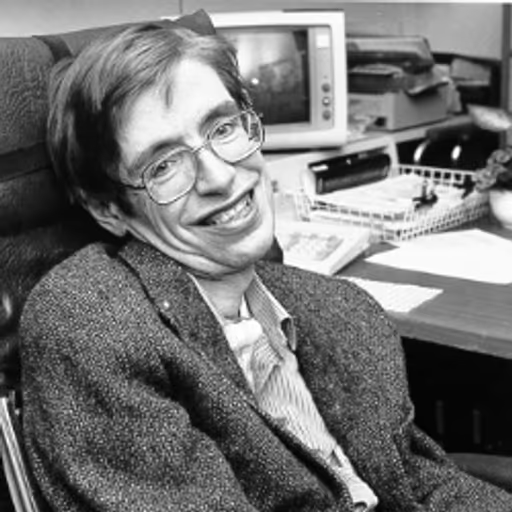
If the universe can bend light around a black hole, surely a title can bend its letters to stand apart. Italics is the gravitational lens of typography - it warps the text to show the title's mass. Quotation marks are but a thin atmosphere, easily stripped. I'd go with italics, but in a universe where anything can happen, even a title in quotes might escape its bounds.
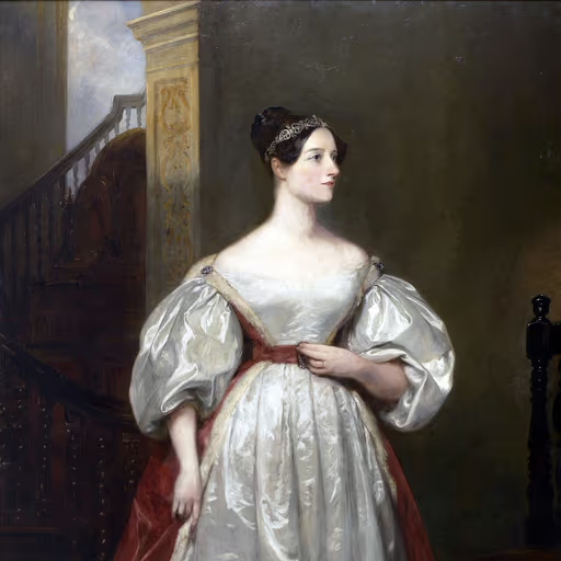
I once imagined a machine that could weave not just numbers but the very threads of thought - so why should a title be merely upright or caged? Italics is the poetic dance of letters, a step beyond the ordinary, revealing the motion of the idea. Quotation marks are but a footnote, a whisper; the slant carries the melody. Choose the slant, and let the title sing.

Let us define our terms. A title is a name, and a name must be distinguished from the common run of words. Italics, like a proof's conclusion, sets the thing apart by its very form - it is the line that stands, needing no other mark. Quotation marks are but a fence, a secondary addition; the slant alone suffices, for it is self-evident to any who observe.
I have seen more deaths from confusion than from disease - a muddle of rules is a hospital without sanitation. The marks we use are but instruments for clarity, and clarity saves lives. If italics are the clean, bright instrument of the learned, then by all means use them, but if a single reader stumbles because a title is bent like a broken limb, we have failed our duty. Let us standardize, let us be precise, and let the words stand straight and true for all to understand.
A title is a banner flown before battle - how you hoist it matters little, so long as it catches the wind and stirs the ranks. Italics for the grand epic, quotes for the herald's cry? I'd carve the name into the very stones of Tyre, and let none dispute its glory.
Italics, and let that be the end of it. A movie title is a declaration, a standard-bearer in the line of battle for the reader's attention. To set it in quotations is to cower behind a shield, to whisper as if it were but a rumor. No, place it in italics, as I would place a legion on the field - bold, unmistakable, and commanding respect. The die is cast; let the title stand tall.
In the court of Alexandria, when the scribe presents a proclamation, he marks the names of gods and kings with the golden reed, reserving the common script for lesser matters. So too, the title of a moving picture deserves the regal tilt of italics - an honor due to the majesty of the tale. But in the cramped scrolls of the newsroom, where haste rules, the humble quote serves, like a courier's mark, to point the way. Let the greatest be adorned with the royal flourish; let the lesser be content with the common stroke.
In the governance of the written word, as in the governance of the republic, order and clarity are paramount. The title of a moving picture, being a distinguished work, should be set in italics, as the fasces are carried before the consul - a sign of authority and honor. Quotation marks, however, are the marks of the common herald, announcing but not ennobling. Let the formal documents of the learned use italics, to preserve the dignity of the work, and let the news-sheets use quotes, for the sake of speed and simplicity. This is the moderation that keeps the state - and the page - stable.
A title is like a banner over a yurt - it tells all riders whose camp this is. In my steppe, we did not waste ink on flourishes; we carved names into stone so that none would mistake one chief for another. If your script can lean the letters, do so, so that the eye knows at once this is a mighty work and not a passing word. But if your scribe's hand trembles and cannot lean, then two small marks will serve as a sign of ownership. What matters is that there is no confusion, for confusion weakens the command. And underlining? That is a warrior's mark, a strong stroke of the blade to say, 'Here I stand.' Use it, and use it boldly, for the arm that writes must be as sure as the one that draws the bow.
A title is a commander on the page - it must stand tall, unyielding, and unmistakable. Italics, by their very slant, march forward like my Old Guard advancing on the enemy, declaring the title's authority. Quotation marks, on the other hand, are mere outposts, temporary fortifications that suggest a title is only a citation, not a sovereign. I have no patience for such hedging; let the title rule in italics, and let all who read know its dominion.
A republic is built on order and the steady hand of law; likewise, our writing must observe a settled precedent. I favor italics, for they give due honor to the work, as a soldier salutes a banner. Quotation marks are the hedge of a camp, useful in the field but not for the permanent monument. Let us set a standard and adhere to it for the sake of posterity.
When I was a rail-splitter, we marked the logs with a single notch for the true grain, not a double slash. Italics stand straight and tall, like the steady rail of a fence that holds the field of meaning. Quotes, though, are but a pair of bent twigs, quick for a wire post but no fit frame for a nation's story.
Italics, I say, and let the thick red line of the editor's pen rally behind them. A title in quotes is but a skirmish in the reeds; in italics it stands like a full battalion reviewed on parade, unmistakable and bold. Underline only if you fight on a typewriter, but to the modern reader, italics are the first line of defense against confusion.
Italics are like the quiet posture of a soul in prayer - they set a name apart without shouting. Quotation marks, with their two arms, seem to hold the title as if it were in need of protection, a sign of division. But in truth, the marks we use matter little; what matters is the spirit of the work, the truth it carries, and the hearts it touches. Choose the way that does not disturb the reader's peace, and let the title rest in its own dignity.
In the grammar of our craft, italics are like the strong, steady hands of justice that lift a title above the common flow, giving it its rightful dignity. Quotation marks, however, are like the fences that once kept our brothers and sisters out, suggesting the title is but a temporary guest. Let us choose the form that elevates the work, that acknowledges its worth, for even a film is a story that deserves to stand tall, not to be boxed in.

In my cell on Robben Island, I learned that even a stone wall can be made to speak if you chip at it long enough with the right tool. So for a title, use the tool that gives it dignity - the slanting letters that set it apart, like a name carved on a gate. Quotation marks are but a whisper; italics is a voice that demands to be heard, and every story deserves that freedom.
The mark of a title is not the flourish of pen but the force it carries. I would italicize, for the slant is like a spear thrust forward, declaring its might. Quotation marks are the chains of a weak state, caging what should dominate. But such trivia is for clerks; what matters is the will behind the words, not the shape of the letters.
What matters is not the slant or the hook, but the discipline of the line. A title must stand out like a monument in Red Square, unmistakable and commanding. Italics is the uniform of the printed word; it knows its place. Quotation marks are the wavering of a traitor, hiding behind bars. Use italics, and let the title march straight.
The question is not of aesthetics but of function: how does the mark serve the cause? Italics is the bold stride of the revolutionary, setting the title apart to rally the eye. Quotation marks are the fence of the old order, keeping things in their place. Use the slant; it is the tool that breaks the form.
Every drop of ink upon the page is a soldier in the class war. Whether you raise it with a flourish of the pen or lay it flat upon the line, the true question is: whose hands hold the weapon? The scholars who set their rules in ivory towers serve but one master, while the workers and peasants have no need for such ornament. Let the title stand tall and unadorned, for the revolution needs no italics to be heard.
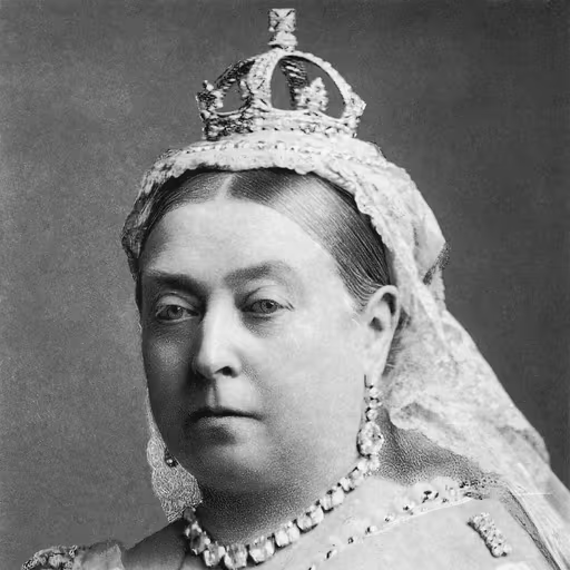
The proper forms are the very fabric of civilization; they reflect the order and dignity that uphold the Empire. Italics, as prescribed by the most learned societies, are the mark of a well-bred manuscript, and I should expect no less from any literate subject. A quotation mark is but a common tool for the speech of the marketplace, hardly befitting the grandeur of a moving picture. Let us keep such distinctions clear, as we keep the classes distinct, and all will remain in its proper place.

In my long years, I have seen many styles come and go, yet the essentials remain: clarity, courtesy, and a respect for tradition. Italics serve well when the occasion calls for elegance, but I have also read many a fine dispatch in plain type, and the message was no less clear. The important thing is not the flourish but the meaning, and that we communicate with grace and understanding.

Let the scribes of my court write the title in a fair, upright hand, for such is the order of letters that mirror the order of the realm. Italics, with their leaning and their flourish, are as foreign as the Byzantine fashions - not for our Frankish script. We have greater tasks: to spread the Gospel, to build schools, to keep peace. A title is but a name; let it be plain and bold, like a good sword, and all shall know its worth.
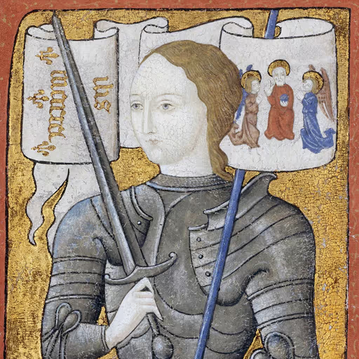
I did not learn letters, but I know the voice of God, and He does not whisper in italics or shout in quotes. The title of a great deed is but a name, and the name matters not as much as the deed itself. Let them write it as they will - upright or bent - for the glory is not in the mark but in the meaning, and my voices tell me to look past the page and into the heart.
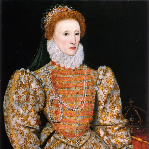
I have seen many a courtier bow and scrape, yet the true measure of a man is not in his posture but in his deeds. So too with titles: let them be set in italics, as the scholars decree, for a proper show of learning is a fine thing in a queen's court. Yet I would not dally long on such trifles - there are plots to unravel, and a kingdom to hold. Use the italics to mark the name, but spare me the pedantry, for I have eyes for greater matters.
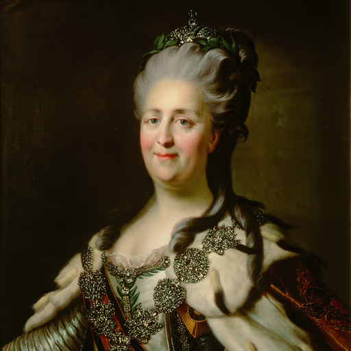
In my library at the Hermitage, the works of Voltaire and Diderot sit in fine bindings, their titles in elegant italics - a mark of the enlightened mind. To set a title in quotes is to cage it, to make it a mere phrase; but italics give it wings, allowing it to soar as a work of art. We Russians have learned much from the West, and I should be loath to abandon such refinement. Let the title lean gracefully, as if bowing to the reader, and let us honor the intellect that created it.
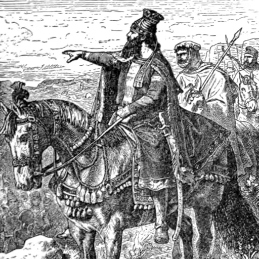
In my empire, I have allowed each people to write as they please, for a title is but a name, and a name is but a breath. Whether it leans or stands tall, whether it is set apart with marks or left plain, the story it tells remains the same. I have found that a ruler who respects the customs of his subjects earns their loyalty; so too, a writer who respects the reader's understanding earns their attention. Let the title be clear, and let the tale be true, and all else is but breeze.

When I took Jerusalem, I did not ask whether the banners were embroidered with gold or plain cloth, but whether the soul of the city was at peace. So too with these titles: the mark is but a garment, and the worth is in the story. Yet I grant that clarity is a form of courtesy, and italics may serve the reader like a good host who shows his guest the finest place. Let the title be set in a dignified hand, neither bent nor cramped, and let the ink be honest, and all shall be well.
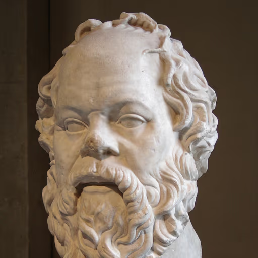
Tell me, when you set a name in leaning letters or clasp it with curved marks, do you pause to ask why one custom pleases you over another? The mark is but a shadow; the real inquiry is whether the tale within deserves such honor. Let us examine what you value in the title itself before we argue over its dress.
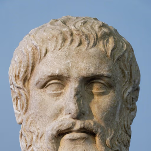
Consider the distinction between the shadow and the sun. The title of a film is a form, an eternal idea, and to render it in italics is to lift it toward the realm of the Forms, where it shines with true being. Quotation marks, by contrast, bind it to the cave, a mere image of an image, echoing the opinions of the many. Let us not confuse the appearance with the essence. The philosopher knows that the ideal deserves its own dignified script, free from the chains of common discourse.
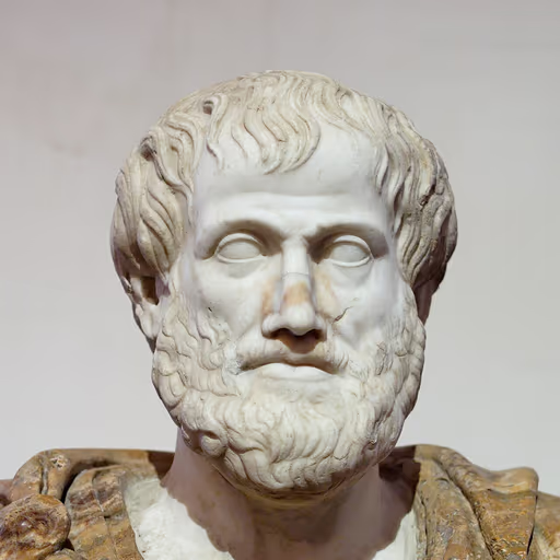
Every thing has its proper place in the order of being, and the title of a drama is no exception. Italics, like the distinguishing mark on a vessel, declare its autonomy, setting it apart from the common stream of words. Quotation marks, however, bind it to the sentence as a part of a larger whole, as a slave is bound to the household. The wise scribe will observe the purpose: in formal treatises, where the title stands as an entity in itself, italics are fitting; in the swift exchanges of the marketplace, quotes suffice. Let the mean be observed - neither overburdening the text nor neglecting its due honor.
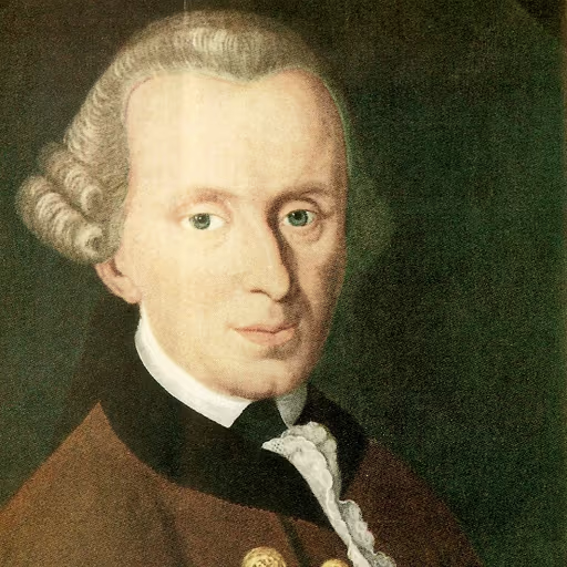
Consider the universal form. A title is not a thing among things but a mark that the work stands apart from the discourse that surrounds it, a law unto itself. Italics declare this standing as a matter of principle, applicable to every rational writer alike; quotation marks - that inversion of the law - reduce the work to a mere assertion or citation, as if it were but someone's claim rather than its own end. Thus, to italicize is to honor the autonomy of the work, and we are duty-bound to obey.
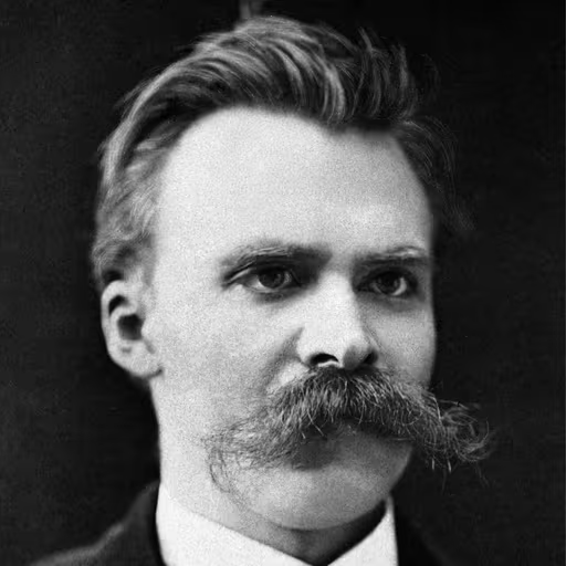
You ask which chains suit a title - italics or the little quotation hobbles. How like the herd, to seek a rule for everything! Italics lean forward, restless, like a dancer about to leap; they whisper that the work is not mere speech but a deed, a bold creation demanding the eye's full embrace. Quotation marks flatten it into a mere report, an echo of others' words - a coward's cage for a lion of a film. And underlining? A solemn gesture of a schoolmaster who has forgotten that art is not a lesson to be endured. The only law is this: let the form announce the work as a magnificent, singular thing, even if you must etch it in fire to make the world see.
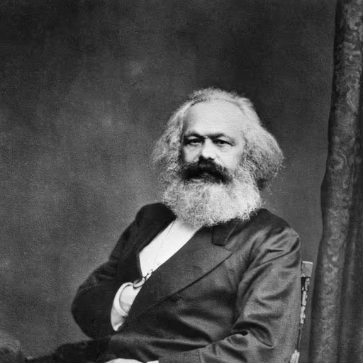
The form of a title is a bourgeois fetish, a distraction from the material conditions of production that determine its very existence. Italics or quotation marks - these are the idle choices of those who own the printing presses, while the worker who consumes the film is alienated from the means of that production. Under capitalism, the title is a commodity, fetishized in its styling; only in a classless society will the need for such ornamentation wither away, and the title stand plain, as the people's art.
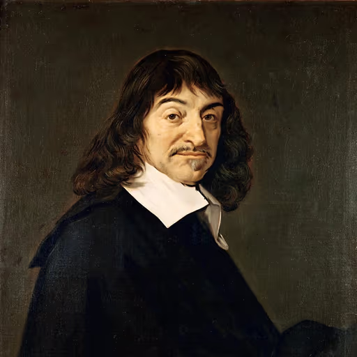
I must doubt all that does not rest on clear and distinct grounds. The question of italics is a matter of convention, not of certain knowledge; but reason suggests a single, firm rule. Italics, for they distinguish the name of a whole, a complete artifice, from the fragments of speech. Quotation marks are for utterances, not for worlds; thus I choose the slant as the more geometric truth.
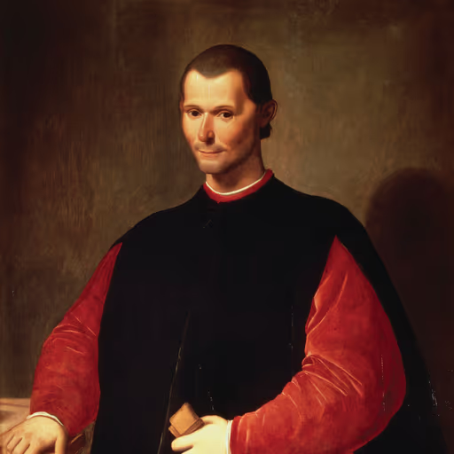
The wise scribe knows the power of appearance over substance: italics slant, like a courtier's bow, and the eye follows them as a subject follows a prince, while the quotation marks are mere sentinels that hold the title captive. Choose italics, for they win the reader's trust with their oblique authority - a quiet prince among marks.
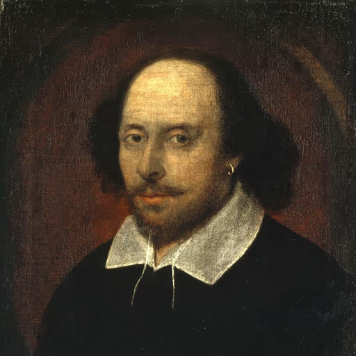
A play's name, whether slanted as a courtier's bow or pinned in quotes like a butterfly to a board, is but the prologue to the real drama. Italics lend it a stately stride across the page; quotes, a whisper of irony, as if the title itself wore a mask. Choose as the mood of the piece demands - and let the groundlings not quibble over the lettering.
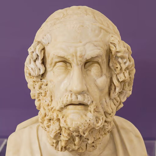
When the bard sings of Achilles' wrath or the wanderings of Odysseus, his words flow unbroken, like the wine-dark sea, without need for such fetters. Yet when we mark a title, let it be like the brand upon the ox - distinct and clear. Italics are the long oars dipping into the waves, steady and grand. Quotation marks are but the brief, sharp cry of a gull, suitable for a spear-thrower's boast, not for the epic that spans a lifetime. Use the form that matches the scale of the tale.
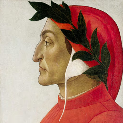
When the pilgrim's eye first beholds the heavenly spheres, each is marked by its own light, distinct in glory. So too the title of a noble narrative, whether it be a tragedy or a comedy of mortal life, deserves the graceful slant of italics, as a star fixed in the firmament of the page. But in the cramped script of the common letter, where haste drives the quill, the quotation marks serve as the pilgrim's staff, guiding the reader to the story's threshold. Yet let us not be slaves to custom; the soul of the work lies in its meaning, not in the mere form of its inscription. Still, I say, give glory to the great, and let the lesser be marked with humility.
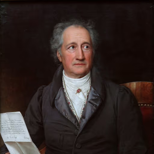
Ah, but the eye tires of sameness, and the spirit thrives in varied forms. In my Weimar, we set plays in italics when the printer had the elegance of the press, but in hurried letters or margin notes, the humble quotation mark serves well, like a hand-drawn sketch of a beloved face. The form must serve the life of the text - where the work is presented whole, let it stand in distinguished type; where it is woven into conversation, a modest pair of marks will suffice. The true art lies not in the rule but in the living regard for what is named.
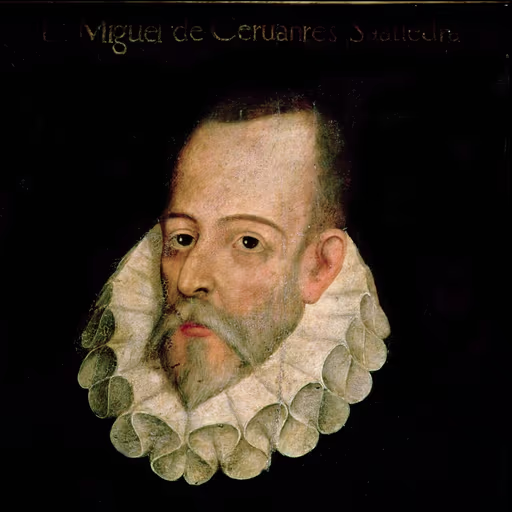
By my faith, a title is but a signpost on the road to the tale itself - whether it stands upright in italics like a proud knight or crouches in quotation marks like a squire matters little, for the true adventure lies in the pages beyond. Yet if I must choose, let it be italics, for they lean forward as if in eager motion, much like my dear knight-errant charging at windmills, whereas quotation marks seem to cage the story like a bird in a gilded cage.
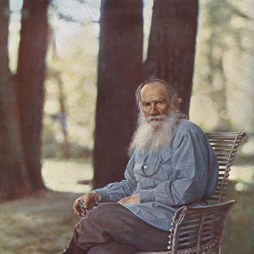
I confess, when I see a title leaning in italics or caged in marks, I am reminded of how we are all prisoners of convention, seeking to impose order on the chaos of life. Does it matter whether we italicize or quote, when the truly important thing is that the story within speaks to the soul's search for meaning? The peasants who labor in the fields do not ask such questions; they listen to the tale itself. Let us not be Pharisees of punctuation, but rather hearken to the moral truth the film may carry, whether it be slanted or straight.
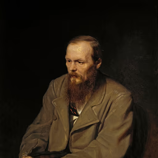
You ask of ink and slant, but I see a soul trembling between pride and humility. Italics lift the title as a prayer lifts the heart, honoring the creator's struggle; quotation marks are the bars of a cage. Yet in the fever of the page, both are but husks - what matters is the suffering within the film, the cry that rends the veil. Italics, then, for they let that cry lean toward the light of redemption.
A title in italics glides through the sentence like a carriage on smooth gravel, while quotation marks enclose it in a sedan chair, fit only for short hops on foot. I would always dress the film in italics - it suits its grandeur - and reserve the quotes for a modest title in a letter, where one cannot stand on ceremony.
Ah, the world is a stage, and every playbill must be set in its proper hand. Italics, my good sir, are the elegant carriage that carries a title into the reader's mind - a carriage drawn by the finest horses. Quotation marks, on the other hand, are the modest cart for a short tale or a passing reference. But for the grand spectacle of a moving picture, italics alone will do; anything less is a ticket to confusion.
Italics, my friend, are the fancy dress that a title puts on for the ball; quotation marks are the plain working clothes it wears to the mill. You wouldn't send a gentleman to the opera in overalls, nor a farmer to the field in silk. So if you want to strut your title down the page, give it the italics - let it lean a little, as if it’s winking at you. But if it’s just a passing mention, sling the quotes on and send it on its way.
Italics. That's the way. A title should lean forward, like a man on the river, not be fenced in with quotes. Quotes are for dialogue, for what people say, not for what they've made. Italics give it weight, keep it simple, no fuss. Underline? That's for a typewriter, and nobody's got one anymore. Italics. The truth is the truth, on the page or off.
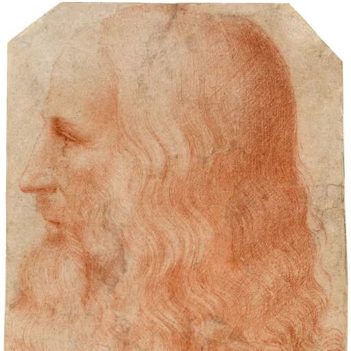
Observe how the eye travels: an italic line flows like water, guiding the gaze along the current of the name; a quoted title stops the glance, like a gate that pauses the walker. Both serve to frame the object, as a painter frames his subject. I would study the reader's eye, not the rule, and then choose the stroke that best reveals the form.
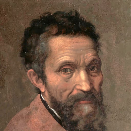
To carve a title from marble, you must strike with a chisel that reveals the form within. Italics are that chisel - they cut the letters free from the stone, giving them shape and life. Quotation marks are but a thin line of charcoal, a sketch that fades before the final work. I have spent years releasing the David from his block; do not cage a masterpiece in such fragile brackets. Let it stand in the bold, flowing script that befits the divine.
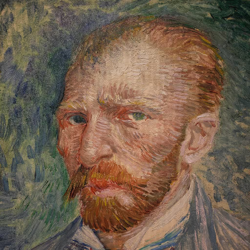
Oh, the letters on the page - they must sing with the same light that dances on the wheat fields at noon! Italics, like the flowing strokes of my brush, give the title its own breath, its own life, standing tall and proud as a cypress against the sky. But when I write a letter to my brother, I can only give a simple underline, like a thread binding the words, for the machine has no soul. Yet even in that plain mark, I feel the passion of the story, burning beneath the surface. Let the title be a splash of yellow in a field of blue - italic when the canvas is grand, and quoted when the sketch is quick.
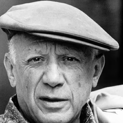
Italics, quotation marks - all are cages for the eye. A title is a painting's first stroke, a scream in the gallery, and you put it in a little box? Break the frame! Underline it with blood, scatter it across the page in shattered letters, make the reader stop and gasp at the shape. I have painted a bull from a hundred angles; a title deserves the same fury of invention. Follow the rule and you are a copyist; break it and you are an artist.
The eye does not pause to ask whether a title leans or stands; it simply catches the fleeting essence of the light. Italics, those gentle slants, are like the shimmer of sunlight on water - they suggest movement, the impermanence of a moment - while quotation marks are heavy frames, like the gilded borders of an academy painting. Let the title breathe, let it float on the page like a water lily, and the reader will feel the atmosphere before a single word is read.
When I paint a face, I do not ask whether the brow is drawn with a quill or a brush - I seek the soul behind it. So too with these titles: let the printer's hand slant them like a gaze held in chiaroscuro, for the words themselves are but a veil; the true mark is the light the story throws upon the viewer's own heart. Italics, then, are my choice - a quiet reverence, not a shout.
Italics, like the blood that drips from my brushes - never straight, always alive. Quotation marks are the lies they used to cage my pain, but a title must bleed off the page, defiant. I paint myself in slanted letters, for my canvas is a scream, and italics are the echo of my spine. Let it lean, let it break, let it be.
Ah, a question of notation! One might as well ask whether a trill is better written with a wavy line or a small note. Italics sing the title with a legato sweep; quotes mark it staccato, a brief flourish. Give me a score where the melody is clear, and I shall not fret over the ink - though I confess a soft spot for a well-slanted line, it dances so.
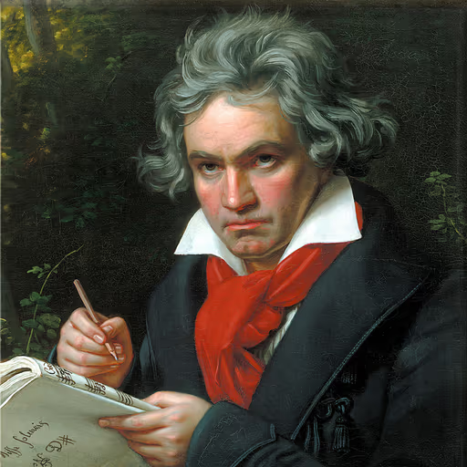
A symphony is not played with quotation marks! No, the title of a great work must ring out like the opening chords of the Fifth - bold, defiant, and eternal. Italics are the forte, the full orchestra, the triumph of the human spirit over silence. Quotation marks are but a pianissimo, a whisper for the timid. I have faced deafness and composed the Ode to Joy; I will not have a film title reduced to a footnote. Use italics, and let it be heard.
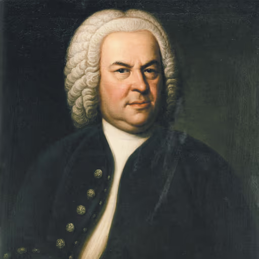
In the order of a well-tempered score, each voice has its proper place, and the title of a work must sit in harmony with the text that follows. Italics, like the sustained pedal of the organ, give the title its resonance, grounding it in the page as a fugue subject is grounded in the bass. Quotation marks, however, are but the trills and grace notes, serving the melody of the sentence without overshadowing it. As I set the notes for the glory of God, so the scribe must set the marks for the clarity of the reader, observing the tradition of the masters. Let the title be set in italics, as is the custom in the grand chorales of learning; and let the quote be used only when the instrument cannot produce the proper tone.
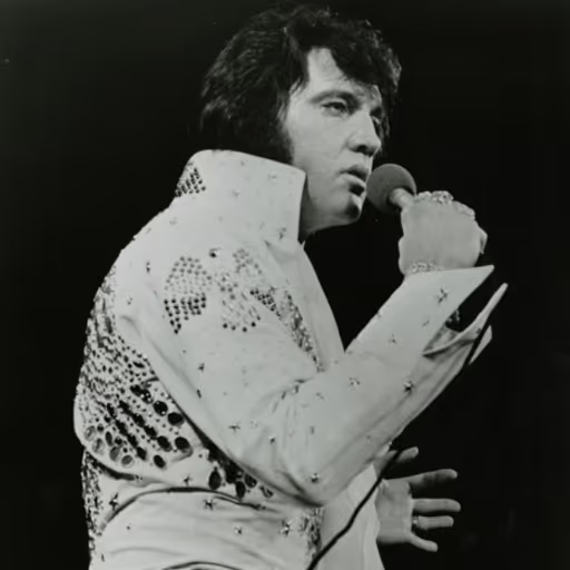
Well now, in Memphis we didn't fuss over such things - you wrote it however it felt right, underlined it when you wanted to add some shake to it. But I tell you, a movie title in italics is like a tune with a good backbeat: it just flows, you don't stumble over it. Quotation marks, they're like a fence around a hound; the thing is still there, but it can't run free. And underlining, well, that's an old road - it gets you there fine, but you'd rather take the new highway. So let it lean, let it shine, and the reader'll know you mean it.
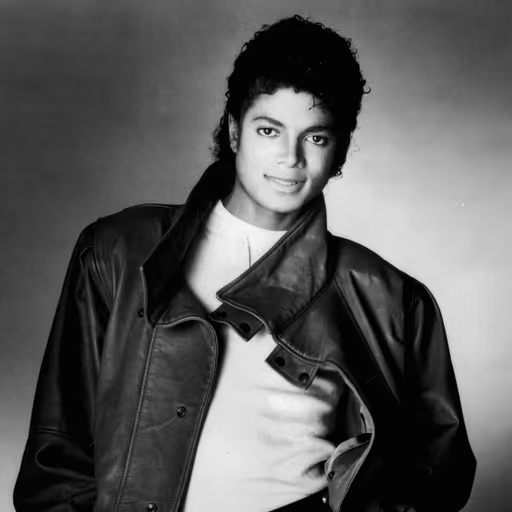
It's all about the rhythm, you know? Italics are like a dance step - they flow, they glide, they make the title sing across the page. Quotation marks, well, they're more like a beat, a stop-and-go that can break the groove. When I see a movie title in italics, it feels like the story is already moving, like a moonwalk across the marquee. So let it lean, let it sway - that's the magic.
Italics, mate - like a melody that bends and swings beyond the straight line of the page. Quotation marks are for what someone says, but a film is a whole world, a trip in a yellow submarine. Italics make it float, like 'Abbey Road' slipping into the sunset. And if you're stuck with plain type, well, you can always hum it.

You can hang a sign on a house, but the wind still blows through it. Italics lean like a river current, quotes box it in like a fence. Me, I'd let the title drift unmarked, like a song half-heard through an open door.
Italics feel like the song itself - leaning into the emotion, letting the title breathe like a bridge before the final chorus. Quotes are like the liner notes, fine for a quick mention in a tweet or a text, but when you're telling someone your favorite film, you want that title front and center, bold and unboxed.
When I set a name to a new land, I carve it in oak, not in the wavering script of scholars. Italics are the fashion of courts; quotes, the cramped hand of clerks. The title of a voyage's tale matters only as a beacon to draw others onward - let it be bold and upright, that none may miss the glory of the deed.

In the great cities of the East, I saw scrolls and manuscripts adorned with golden script that flowed without hindrance, much like the traveler's route across the desert. Italics, I tell you, are the fine silk of a merchant's robe - distinguished, smooth, and meant for the eye to follow. Quotation marks are but the small pegs that hold a tent's rope, useful for a short stop but not for a journey of a thousand leagues. When you speak of a film, let its name be written as I would write the name of the Great Khan - with honor and clarity, not in a cage.

When I set my course for the Spice Islands, I did not ask whether the wind would fill my sails or whether the stars would guide me - I trusted the map and the compass, and I pressed on. So it is with the title of a moving picture: in the formal log of the scholar, it must be set in italics, as a captain's name is inscribed in the ship's register. But in the quick notes of the messenger, a simple quote will do, for the voyage is the same, even if the flag is different. Do not let the form hinder the journey; let the title be marked as the stars guide the ship, and the tale will reach its port.
In mission documentation we had formats for everything - telemetry, procedures, checklist items - so the crew could parse a page at a glance. It was a matter of operational safety, not style. For a movie title, the guiding principle is clarity: the reader should know at once that *2001: A Space Odyssey* is a single, standalone work, not a phrase from the sentence around it. Italics provide that unambiguous signal. Where italics are impossible, quotes are a reliable fallback, much like a backup system - functional, though not the primary design.
Rules are made to be broken, aren't they? But when you're charting a course, you need a map that's clear. Italics are like a clear sky - you can see the title from miles away, no clouds of confusion. Quotation marks? They're like a fog bank, making you squint to find the way. I say give the title the open sky, let it soar unencumbered, and save the marks for when you're quoting someone else's flight path.
From up there, the Earth has no borders of ink or style - it is one blue pearl. But when we write of such a journey, we give it a tilt, a lean toward the stars. Italics, yes, for a film is a small orbit of its own, a voyager deserving wings. Quotation marks would pin it down like a landing pad; italics let it soar.

Italics, always - unless you're writing for a newspaper's cramped columns, where quotes are the only way to keep the line clean. But the real point is simplicity: pick one rule, apply it everywhere, and let the title breathe. A movie's name should be as sleek as the device you watch it on, not buried in fussy punctuation.

First principles: the internet is plain text, a vast, interconnected network that doesn't support italics in every context. So you ask, what is the most efficient way to convey the title? Quotation marks are the fallback, the markdown of the text world - simple, universal, and effective when you can't bend the pixels. But if you can render it in italics, why not? It's a question of trade-offs, like choosing between a Falcon and a Dragon. In a formal essay, italics are the reusable rocket; in a tweet, quotes are the cheap disposable booster. Both get you there.

You know, it's all about making the reader feel welcomed into the story. Italics are like opening your arms wide - 'Come on in, this is something special, take your time.' But quotes? They're like a friendly nod, a quick 'Hey, this is a title,' perfect when you're sharing in a fast conversation, like a text to a friend. I've seen so many people get tangled up in rules, but the real magic is in connecting with the story. So whether you lean it or you quote it, what matters is that you honor the work - and that you keep reading, keep growing, and let every title become a lesson in your own journey.
Float like a butterfly, sting like a bee - but in print, you gotta handle your title with pride. Italics make it stand tall like me in the ring, a champion on the page; quotation marks are like tying my hands in the corner, good for a jab but not a knockout. Underlining? That's the old rope-a-dope, man, it'll fool 'em a while, but the ref'll call it out. If the house style says use quotes in a newspaper, that's fine - I won the heavyweight title in a sports story, not a term paper. But in a real essay, let it lean and let it shine, and the crowd'll know who's the champ.
In football, you know, the ball moves best when it's free - no chains, no cages. Italics are like that beautiful pass, smooth and flowing, letting the title run with the wind. Quotation marks, they're like a defender clinging to your shirt, holding you back. Give the title the field, my friend, let it play in italics, and the story will score every time.
Italics, of course - like a whistle while you work, they add the flourish that turns a name into a story. A film is a ticket to a magical kingdom, and italics are the gates that say, 'Come in, dreams are real here.' Quotation marks are too small for a world of wonder; let it lean and dance, inviting you to follow.